View
I built a data-driven dashboard to help my family stay organized.
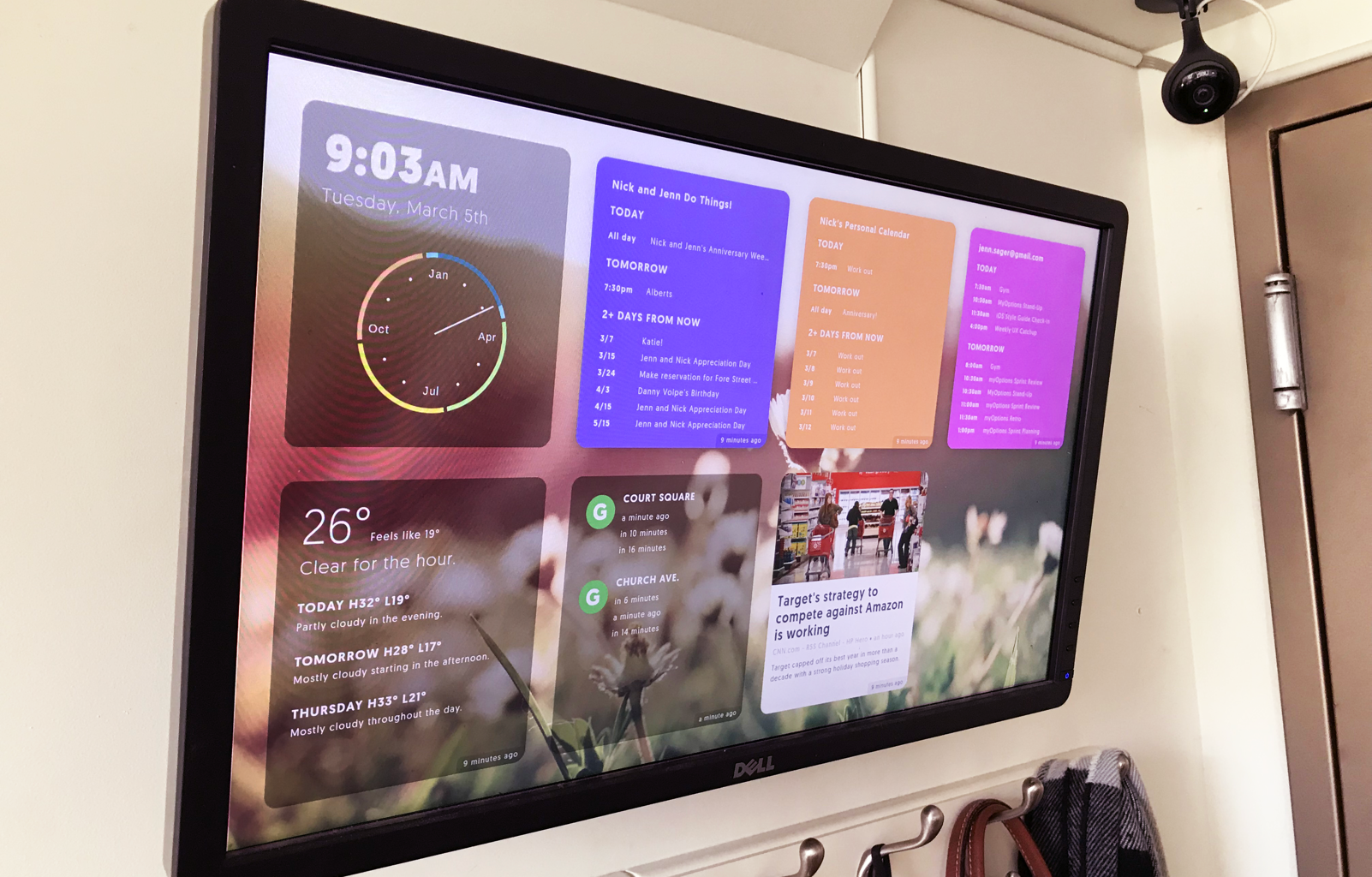
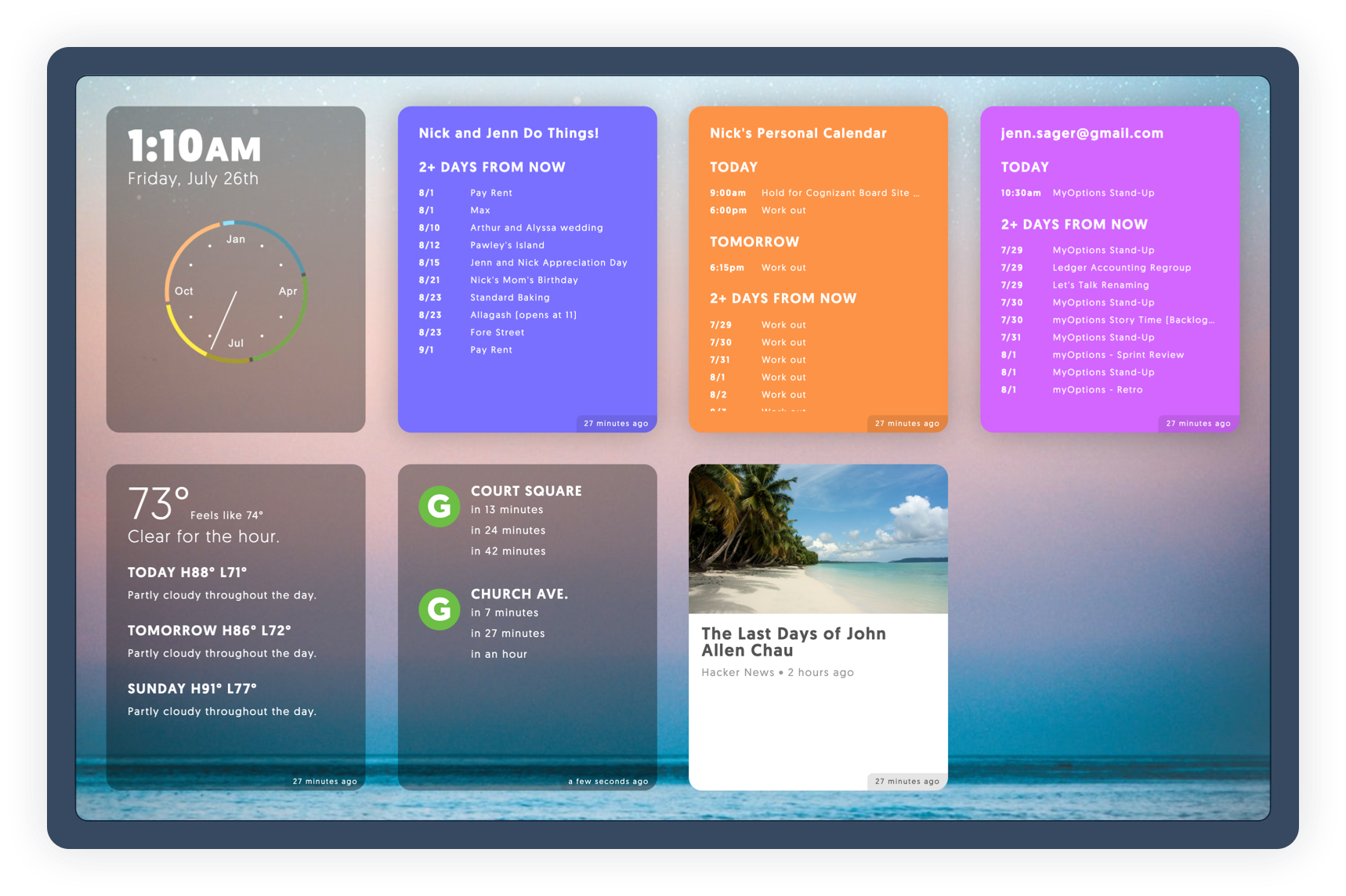
The idea behind View was all about exposure--bringing otherwise hidden data out in the open. I love using Google Calendar to remember important events, but just like putting things into a drawer, they can easily fall into the category of "out of sight, out of mind." I wanted the flexibility and seamlessness of a calendar app with the simplicity of an old fashioned hanging wall calendar.
So I combined these concepts into a web app that could showcase not just upcoming events, but other pertinent information that would be helpful as I walked in or out the door. I then hung a monitor to display it right above our coat rack. It's worth noting I did this about a year before the Google Home Hub and Echo Spot were out on the market. To find out more about why I built View, check out my article on Medium. Or, check out my code on Github.


